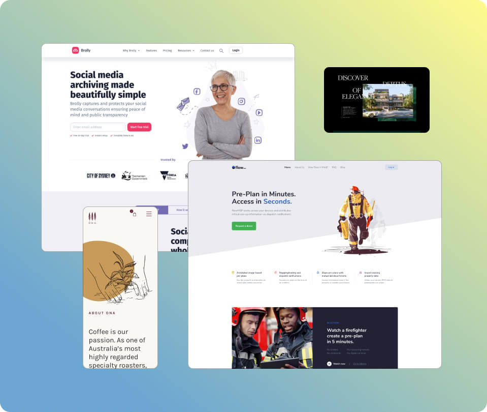
 Code conversion from Figma/XD/Sketch to hand-coded pixel-perfect HTML/CSS/JS
Clean, well-structured, and well-written code is essential for website performance and maintainability. We use SCSS to pre-compile CSS code, ensuring it’s clean and well-organised. Here are some of the standards we adhere to when coding your project.
Tailored interactivity and animation to elevate your website
With every project, we devote our efforts not only to ensuring that the site aligns with your design and functions responsively but also to placing significant emphasis on animations that leave a lasting impression on your audience. When we receive a project, we carefully plan and visualise animations and interactivity that best complement the design concepts.
As a minimum, we incorporate the following interactivity and animations in every project:
- Rollover effects applied to all links and buttons.
- Custom fade-in, fade-out, and easing effects to suite the design.
- Implementation of image and content parallax where appropriate.
- Other custom effects that we think would help lift the overall presentation of the site.
Our team also possesses extensive experience with animation libraries, including GSAP (GreenSock), scroll-based triger animiation, SVG animation, wow.js, and animate.css, should you require us to take your project to the next level.
Rigorous standards for frontend coding </>
- Using SCSS variables
- Using SCSS mixins
- Breaking down modules into separate SCSS files
- Modular styles
- Clean & nested code
- Using multiple selectors
- Strict use of heading levels
- Commented and indented code
                                                							  /*
  ** Font variables
  */

  //Primary font
  $font-primary: 'HelveticaNeue';

  //Other font
  $font-secondary: 'Arial';

  /*
  ** Color variables
  */

  //Primary colour
  $color-primary: #000000;
  $color-highlight: #ffa4a4;

  //Secondary colour
  $color-white: #ffffff;
  @mixin large-text {
    font: {
      family: Arial;
      size: 20px;
      weight: bold;
    }
    color: #ff0000;
  }

  .page-title {
    @include large-text;
    padding: 4px;
    margin-top: 10px;
  }
  //Global styles
  @import "variables";
  @import "font";
  @import "mixin";
  @import "reset";
  @import "nav";
  @import "header";
  @import "content";
  @import "footer";

  //Components
  @import "slider";
  @import "sidebar";
  @import "call-to-action";
  @import "animation";
  .banner{···}

  .news{···}

  .events{···}

  .media{···}
  #main {
      @include primary-text;
      @for $i from 1 through 3 {
        .item-#{$i} { width: 2em * $i; }
      }
      h1{
          font-family: $font-primary;
      }
      .element{
          @include content;
          .title{
              @include title;
          }
      }
  }
  //If there are multiple selectors for a style block, we seperate them onto their
  //own line rather than having them on one line. This helps readability and
  //preventing long lines.

  .appForm .formContainer .appButton,
  .appForm .formContainer .appButton,
  .appForm .formContainer .appButton {
    background-color: #fb94d2;
  }
  //Semantic and well-nested heading levels

  <section class="call-to-action">
    <h1>Authenticity</h1>
    <p class="callOutText">Combining expert craftsmanship with state-of-the-art technology.</p>
    <h2>Events</h2>

    <h3>Mint industry</h3>
    <h3>Conference 2020</h3>
    <h3>Mint industry coin award</h3>

    <h2>Contact information</h2>
  </section>
  #main {
      @include primary-text; //Applies primary text styles
      @for $i from 1 through 3 {
        .item-#{$i} { width: 2em * $i; }  //Dynamic width for .item-1, .item-2, .item-3
      }
      h1{
          font-family: $font-primary;
      }
      .element{
          @include content; //Includes general content styles
          .title{
              @include title;
          }
      }
  }
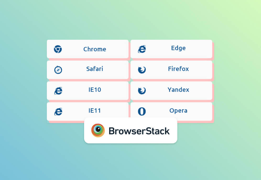
Rigorous QA process for browser compatibility
We use a blend of automated and manual testing to ensure your website works great on various devices, browsers, and screen sizes.
Testing with BrowserStack
Every page of your website undergoes automated testing via BrowserStack (www.browserstack.com). Our team leverages BrowserStack to automate tests and identify compatibility issues.
Testing on real devices
We go beyond mere simulator testing. Each page is rigorously tested on real devices and various browsers, to ensure that no detail is overlooked.
Every little detail counts
We pay exceptional attention to detail when building front-end (HTML/CSS/JS) pages. Explore by clicking the pins on the bee 🐝.
Semantic HTML
Using semantic HTML is essential for a well-optimised, SEO-friendly site and compliance with accessibility standards. We code high-quality semantic HTML, using appropriate tags to accurately structure the content on your site.
- <h1> – <h6> for heading levels
- <ul> and <ol> for lists
- <blockquote> and <cite> for testimonials and citations
- <figure> and <figcaption> for figures and image captions
- and much more
Built with Accessibility in mind
We rigorously test our code against ADA and WCAG 2.1 AA standards to ensure a highly accessible site. Our team also has the expertise to achieve full ADA and WCAG 2.1 AA/AAA compliance.
Optimal image compression
The size and compression of images play a crucial role in your website’s loading speed. We use lossless compression tools like TinyPNG to optimize image sizes and define custom crop sizes within the CMS to ensure faster page load times and improved performance.
Smart and intelligent layouts
We use grid systems and flexbox layouts to build layouts with flexibility in mind. This ensures that the layout maintains its integrity and appearance, even when columns or content are added or removed.
Left Antenna | Icon graphics
We'll create favicon, Facebook openGraph image, and Apple/Android app icons for your website even if you don't supply them.
We also use iconFont for coding SVG icons so that nicer hover effects can be applied.
Right Antenna | Pixel perfect precision
We ensure your pages are pixel-perfect, precisely matching your intended design.
Furthermore, we exercise our best judgment to rectify any design issues during development.
Compound Eye | Accessibility
Our pages are built with WCAG 2.1 AA and ADA compliance in mind regardless of whether it is specifically requested.
Expect alternative text, proper keyboard indexes, arial-labels and high quality semantic HTML to be used on every project.
Foreleg | Image alt text and titles
We add title text to icons that need to be explained, and alt text to images that require describing.
Thorax | Style reset
Expect common HTML typography elements such as links, lists, nested lists, strong, emphisis, tables to work nicely within content sections.
Forewing | Image compression
SVG graphics are used where possible and all images are properlly sizes.
Images are also compressed using TinyPNG for lossless compresssion to further reduce size and loading times.
Hindleg | Use of SCSS
We alwatys code with SCSS to pre-compile the CSS, no exceptions. This ensures consistency and high-quality styling across all projects.
Expect the use of BEM naming conventions for classes and modular SCSS files.
Abdomen | Smart layouts
We build layouts to be smart and not just static.
Grid systems and flexbox layouts are used to build intelligent layouts with flexibility in mind to ensures that the layout maintains its integrity and appearance, when columns or content are added or removed.
Pollen Combs | Hover effects
Hover effects are added to every link and button, no exceptions
Feel free to request custom hover effects in your design, or trust us with our best judgement.
Hindwing | Sticky menu
Unless otherwise requested, we add sticky menus to all website builds.
Modular breakdown of SCSS and template files
Our SCSS files are modularised into separate files based on their purposes. For example, variables such as colours are specified in _variables.scss. Typography related styles are specified in _fonts.scss, components are coded in _header.scss and _footer.scss, and specific page styles are specified into each page template.
Build process
During the build process, all SCSS files are combined and minified into a single CSS file. Additionally, upon request, we can use build tools and task runners.


	                                    							  /*
  ** Font variables
  */

  //Primary font
  $font-primary: 'HelveticaNeue';

  //Other font
  $font-secondary: 'Arial';

  /*
  ** Color variables
  */

  //Primary colour
  $color-primary: #000000;
  $color-highlight: #ffa4a4;

  //Secondary colour
  $color-white: #ffffff;
  @mixin large-text {
    font: {
      family: Arial;
      size: 20px;
      weight: bold;
    }
    color: #ff0000;
  }

  .page-title {
    @include large-text;
    padding: 4px;
    margin-top: 10px;
  }
  //Global styles
  @import "variables";
  @import "font";
  @import "mixin";
  @import "reset";
  @import "nav";
  @import "header";
  @import "content";
  @import "footer";

  //Components
  @import "slider";
  @import "sidebar";
  @import "call-to-action";
  @import "animation";
  .banner{···}

  .news{···}

  .events{···}

  .media{···}
  #main {
      @include primary-text;
      @for $i from 1 through 3 {
        .item-#{$i} { width: 2em * $i; }
      }
      h1{
          font-family: $font-primary;
      }
      .element{
          @include content;
          .title{
              @include title;
          }
      }
  }
  //If there are multiple selectors for a style block, we seperate them onto their
  //own line rather than having them on one line. This helps readability and
  //preventing long lines.

  .appForm .formContainer .appButton,
  .appForm .formContainer .appButton,
  .appForm .formContainer .appButton {
    background-color: #fb94d2;
  }
  //Semantic and well-nested heading levels

  <section class="call-to-action">
    <h1>Authenticity</h1>
    <p class="callOutText">Combining expert craftsmanship with state-of-the-art technology.</p>
    <h2>Events</h2>

    <h3>Mint industry</h3>
    <h3>Conference 2020</h3>
    <h3>Mint industry coin award</h3>

    <h2>Contact information</h2>
  </section>
  #main {
      @include primary-text; //Applies primary text styles
      @for $i from 1 through 3 {
        .item-#{$i} { width: 2em * $i; }  //Dynamic width for .item-1, .item-2, .item-3
      }
      h1{
          font-family: $font-primary;
      }
      .element{
          @include content; //Includes general content styles
          .title{
              @include title;
          }
      }
  }
Left Antenna | Icon graphics
We'll create favicon, Facebook openGraph image, and Apple/Android app icons for your website even if you don't supply them.
We also use iconFont for coding SVG icons so that nicer hover effects can be applied.
Right Antenna | Pixel perfect precision
We ensure your pages are pixel-perfect, precisely matching your intended design.
Furthermore, we exercise our best judgment to rectify any design issues during development.
Compound Eye | Accessibility
Our pages are built with WCAG 2.1 AA and ADA compliance in mind regardless of whether it is specifically requested.
Expect alternative text, proper keyboard indexes, arial-labels and high quality semantic HTML to be used on every project.
Foreleg | Image alt text and titles
We add title text to icons that need to be explained, and alt text to images that require describing.
Thorax | Style reset
Expect common HTML typography elements such as links, lists, nested lists, strong, emphisis, tables to work nicely within content sections.
Forewing | Image compression
SVG graphics are used where possible and all images are properlly sizes.
Images are also compressed using TinyPNG for lossless compresssion to further reduce size and loading times.
Hindleg | Use of SCSS
We alwatys code with SCSS to pre-compile the CSS, no exceptions. This ensures consistency and high-quality styling across all projects.
Expect the use of BEM naming conventions for classes and modular SCSS files.
Abdomen | Smart layouts
We build layouts to be smart and not just static.
Grid systems and flexbox layouts are used to build intelligent layouts with flexibility in mind to ensures that the layout maintains its integrity and appearance, when columns or content are added or removed.
Pollen Combs | Hover effects
Hover effects are added to every link and button, no exceptions
Feel free to request custom hover effects in your design, or trust us with our best judgement.
Hindwing | Sticky menu
Unless otherwise requested, we add sticky menus to all website builds.